PUBLISHING II: PROJECT 2

(Week 6- Week 9 )
Ashila Putri Sandi
Publishing 2: Mass Communication
Project 2: Layout & Final Mock-up
LECTURE
Lecture 4: The Grid
5/10/18 (Week 6)
This lecture was started with a question " Can we design without using a grid?". I personally think that we can design without using a grid because abandoning the grid allows freedom and expand creativity to be unleashed, though the designer still needs to control this in order to avoid somewhat dysfunctional result.
A grid provides a structure and constraints within which a design is to be arranged. At times the use of a grid is not appropriate, perhaps due to the nature of the material to be presented, or the visual effect that the designer wants to produce.
Rester System:
- Layout --> geometric
- Patterns and variations --> mathematics
The purpose of using the grid is to maintain the coherent of the layout and also for the functional purpose. The grid is modular in nature. Our responsibility as designers is towards those who are going to experience and use/interact with our works.
INSTRUCTION
PROGRESSION
Week 6
On the previous week, we were told to choose our typeface and try to make a type specimen. Before start doing the layout, first, we needed to determine the typeface for heading, body text, and so on.
Week 6
On the previous week, we were told to choose our typeface and try to make a type specimen. Before start doing the layout, first, we needed to determine the typeface for heading, body text, and so on.
Chosen typeface:
- Header: Avenir Heavy 21/12pt
- Body text: Avenir 9/12pt
- Pull quote: Avenir Italic 9/12pt
- Subtext: Haven't decided that time
References
 |
| Fig 1.1 References for Layout |
 |
| Fig 1.2 References for Typeface |
I attempted to do my first layout of the first chapter. After tried to print it out, I got tons of feedback, and Mr. Vinod helped me to fix the problems. After that, I changed my typeface after looking through Google Fonts and search for similar typeface from the reference that I found on Pinterest.
- Header: PT Serif 30/36pt
- Body text: Avenir 8/11pt
- Pull quote: Avenir Italic 8/11pt
- Subtext: Avenir Heavy 7/11pt
 |
| Fig 1.3 Printed Out First Draft after Feedback |
 |
| Fig 1.4 Printed Out First Draft after Feedback |
Week 7
Book Cover
I attempted to make the cover of my book.
 |
| Fig 1.5 Options for Book Cover |
 |
| Fig 1.6 Options for Book |
Week 8
Layout
There was some specific feedback this week, but we just needed to complete the book and bring the black and white mock-up on the following week. The title before was "Uncover self-discovery journey", but Mr. Vinod told me to change it to "Uncover: A journey of Self-Discovery".
Week 9
Mock-ups
Black and White Mock-up
 |
| Fig 1.7 Black and White Mock-up (Front) |
 |
| Fig 1.8 Black and White Mock-up (Content Inside) |
 |
| Fig 1.9 Black and White Mock-up (Content Inside) |
 |
| Fig 1.10 Black and White Mock-up (Content Inside) |
 |
| Fig 1.11 Black and White Mock-up (Content Inside) |
 |
| Fig 1.12 Book Cover Option |
 |
| Fig 1.13 Book Cover Option (Chosen one |
Week 10
SUBMISSION
Thumbnails
 |
| Fig 2.1 Cover |
 |
| Fig 2.2 Thumbnails Half Title until Introduction |
   |
| Fig 2.5 Thumbnails Chapter 3- References |
Spreads
 |
| Fig 2.6 Cover |
 |
| Fig 2.7 Half Title |
 |
| Fig 2.8 Full Title |
 |
| Fig 2.9 Content and Imprint |
 |
| Fig 2.10 Introduction |
 |
| Fig 2.11 Chapter 1 |
 |
| Fig 2.12 Chapter 1 (2) |
 |
| Fig 2.13 Chapter 1 (3) |
 |
| Fig 2.14 Chapter 2 |
 |
| Fig 2.15 Chapter 2 (2) |
 |
| Fig 2.16 Chapter 2 (3) |
 |
| Fig 2.17 Chapter 2 (4) |
 |
| Fig 2.18 Chapter 3 |
 |
| Fig 2.19 Chapter 3 (2) |
 |
| Fig 2.20 Chapter 3 (3) |
 |
| Fig 2.21 Chapter 3 (4) |
 |
| Fig 2.22 References |
 |
| Fig 2.23 Back Cover |
Final Book (PDF)
For the book, I used saddle stitch binding to make the binding stays longer. I used maple bright for the content and Ivory (slightly thicker) for the cover and back cover.
 |
| Fig 3.1 Final Mockup (Cover) |
 |
| Fig 3.2 Final Mock-up (Half Title) |
 |
| Fig 3.3 Final Mockup (Spreads) |
 |
| Fig 3.4 Final Mockup (Spreads) |
 |
| Fig 3.5 Final Mockup (Spreads) |
 |
| Fig 3.6 Final Mockup (Spreads) |
 |
| Fig 3.7 Final Mockup (Spreads) |
 |
| Fig 3.8 Final Mockup (Spreads) |
 |
| Fig 3.9 Final Mockup (Spreads) |
 |
| Fig 3.10 Final Mockup (Spreads) |
 |
| Fig 3.11 Final Mockup (Back Cover) |
FEEDBACK
Week 6
Specific Feedback: I needed to re-arrange my half-title and full-title page and change the typeface because Mr Vinod said that my chosen one was ugly. Then Mr Vinod helped me to increase the legibility of my first chapter and he wanted me to show him my references. After he helped me to fix the imprint and content page, I managed to follow the style that I already had that time and finish the first chapter. After several feedbacks after, Mr Vinod said it was almost there.
General Feedback: Mr. Vinod told us about how printing works, we can only use CMYK for body text.
Week 7
Specific Feedback: There were some pages that I needed to re-arrange because of the layout and Mr Vinod said that the "$" sign had a different style from the other visuals. However, I managed to finish the book from imprint to the 3rd chapter but I still needed to re-check my layout and text formatting.
General Feedback: Mr Vinod broke down the timeline for the rest 7 weeks in this semester. For the following week, Mr Vinod wanted us to do the animated version of our visuals, and create our book cover.
Week 8
Specific Feedback: After I showed my progression for the animated GIFs and my book cover, Mr Vinod gave me several feedbacks. He told me that the GIFs were good to go but I might want to emphasize some of my visuals to give them more depth. However, he said that the rest of the GIFs were good. For the title he wanted me to change my title from "Uncover: Self-discovery Journey" to "Uncover: A Journey of Self-discovery". Moreover, he suggested some new ideas for my cover, though I have shown him 3 options that I made before.
Week 9
Specific Feedback: I showed him the black and white mockup of my book. He said I needed to check part of visuals that were going to be folded. He told me to add some space. The typesetting was good to go, the text’s readable. For the e-book, he told me to get it done by that day and show him with the navigation.
General Feedback: Print the final mockup for our book with the chosen paper. Finalize the e-book with all the navigations and start doing the iPhone size e-book. Update blog and read the lecture notes in Times. Do not post the power point slide on our blog, we must summarize with our own words/understanding.
REFLECTION
Experience
I really enjoyed doing this project because it allowed me to create my own content of my book and I could freely choose my visual style. I chose digital doodling/drawings because I felt like it would be easier for me and I loved doodling with my tablet. While I enjoyed doing the visuals, I could work faster and get my things done on time. Thus, I could focus on the layout. However, I was a bit struggling while doing the layout, but because of Mr Vinod feedback and help I could finally figure out the layout of my book and once I adapted it on my first chapter I could easily adapt it on the other chapters.
Observation
I observed that a different person has their own strength and weakness. From this project, I feel like there were many of my classmates that were struggling in terms of the layout, some of them were worrying about their visuals, and so on. Personally, I observed that I had problems with the text formatting.
Findings
There were a lot of things that needed to be considered while making a book. It was not as easy as it looked. Once you got the layout that suits your book on the first chapter, you can easily adapt it to another chapter. Moreover, I found that I need to learn more about text formatting, and having a mockup printed book was really helpful for me to see the actual size of the layout and the text point size.
FURTHER READINGS
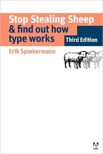
Stop Stealing Sheep & Find Out How Type Works by Erik Spiekermann
From this book, I learned about type express emotion. It says that these days people need better ways to communicate to more diverse audiences. We know from experience that what we have to say is much easier for others to understand if we put it in the right voice; type is that voice, the visible language linking writer and reader. With thousands of typefaces available, choosing the right one to express even the simplest idea is bewildering to most everyone but practiced professionals.
It is stated in this book that type express emotion has personality expressed in its physical characteristic: light or heavy, round or square, slim and squat. In addition, there's dark emotion which characteristic is black typeface with sharp edges.
Pleasant feelings are best evoked by informal, light character. The more character in a word, the more chances there are to find the right letterforms to express its meaning.

A Guide to Layout, Design & Publication by Scott Downman
From this book, I only read several chapters that I found interesting and useful for me.
Evolving Editing - Layout and Design Transition
According to this book, the emphasis on layout and design is a relatively new phenomenon but the concept of publishing information is as old as the printing press. In the past 100 years of news production, significant advances in technology and innovations in design have transformed news publication from simple information sheets to visual forms of entertainment.
The technology at this stage made it difficult to produce a more sophisticated design, nor was there need to. The people reading newspapers were from the middle classes who were anxious for news of domestic and world affairs. the was little need to entice them to buy a paper.
Culture and News Production
Sub-editing, layout, and design are heavily influenced by culture. This invisible and difficult to define factor influences ethics, news selection, the use and type of language and the kinds of images that are published. The relationship between culture and sub-editing is something that is rarely talked about.
Fonts and Formats
- Understanding typography will make you a more effective sub-editor, as you will be better at presenting readable publications.
- Not only relates to font selection typography also relates to font alignment, presentation, spacing, and order. It is about assisting and guiding the reader through a story and a publication
- Typography is evolving thanks to the emergence of online technology. There are now over 10.000 fonts in use.
- Online publications have prompted a change in text preferences, namely the increased use of sans serif fonts for body text. Serif fonts are still favored by newspaper.
Writing Headlines and Captions
- Headlines and captions are the important labels that draw people to stories. Headlines are the most dominant words on a page and the second most dominant element after photographs.
- Headlines and captions must be accurate, grammatically correct, written in active voice and present tense.
- Headlines must be able to sum up complex issues in as little as three words. It is a paradox because writing headlines appear simple but is often a complex task.
Power Pictures
- Photographic editing involves understanding the three Cs: content, composition and cropping.
- The shape of a photograph and the way it has been cropped will impact the way the reader perceives and interprets an image


Comments
Post a Comment