PACKAGING AND MERCHANDISING - PROJECT 2
06/05/19 - 27/05/19 (Week 6 - Week 9)
LECTURE NOTES
INSTRUCTION
PROGRESSION
Exploration on the colors.
SUBMISSION
After Feedback:
FEEDBACK
20/05/19 (Week 8)
Specific feedback: [online] It's quite contrast with the design element. I suggest you include some motif or traditional patterns into the design but make it contemporary.
10/06/19 (Week 11)
Specific feedback: The design is nice, it was hard to open the sleeve, you may want to make the sleeve slightly bigger.
17/06/19 (Week 12)
Specific feedback: Maybe add more of the flower to the sleeve because it's too plain on some part. Try to add ribbon and change the background color if you have time.
REFLECTION
Experience
I need to admit that packaging design is not my cup of tea. It was frustrating for me to think about all the measurement and because I was away from school and they don't have any laser cut service near my hometown, I had to cut my cardboard myself, also the sleeve and card. I failed a couple times, but I tried again. It was not my best work, but I tried to complete the project on time. I don't like to submit my project late, so I rushed myself for this one. Moreover, I felt like I wasn't using my time properly, thus I was so panic for this project, I was rushing and didn't put enough attention to some part of the task. Moreover, It was challenging to come up with an innovative packaging, because It was already hard for me to create a simple one, so I was afraid to try something new, and ended up choosing the possible type of packaging. After all, my chosen toy, which was congkak was quite big and hard to be packaged. Usually, they sell it without a packaging. Hence, I had to make the packaging easy to use as well, and also protective.
Observation
Through this project, I observed that usually traditional toys are not sold with a packaging. So, it was a clever idea to make a packaging for a traditional toy. Moreover, the design must not be traditional and outdated, we can make it more modern, trendy, but still include the culture aspect into it. I also observe that the shape of the packaging must be reasonable and easy to use not only innovative.
Findings
I found this project quite interesting, tiring, but I liked designing the packaging. I have learned that I needed to be more responsible for my action, wether in real life experience or my design. My design must reflect the actual purpose of the product, it should communicate well through the packaging. It was not easy to attract people with our own taste of design but we can always do some research, never give up to ask for opinion from lecturer or friends, and try to be professional when designing. Although it was not my best outcome, I hope that on the final project, I could explore more on packaging and learn to communicate through my design better.
Ashila Putri Sandi (0332938)
Packaging and Merchandising Design
Project 2 - Traditional Toy Packaging
LECTURE NOTES
29/05/19 ( Week 10)
Packaging and Branding
From the presentation from group 7, they were presenting about packaging and branding and how are they connected to each other. Branding is also known as brand identity is the visible/tangible elements of a brand. It could be the color, design, logo, meterials, typography, and so on. From the presentation I took some notes about how is packaging involved in branding.
1. With branding, the packaging makes the product recognizable.
2. It represents the brand ideals
3. The brand can acquire more visibility and coverage
Moreover, I learned something new from this presentation. It was about branded house and house of brands. Branded house is the most common strategy and keeps the main brand name attached to every sub-brand. Usually it builds a very strong brand which both can be easily recognizable and memorable. For example: Google and Apple.
On the other hand, house of brands also called HOB is the complete opposite of Branded House. Sub-brands are featured or promotes, rather than the company or corporate brand. Sub-brands may detract from the main brand. For example Unilever and P&G, both of them have multiple branch and have a lot of other brands under them.
Lastly, there are hybrid which is the mix of branded house and house of brand. Usually the brand has an initial product, eventually chooses to expand its offering, and includes drink and food products too.
Furthermore, branding is a crucial part in packaging design. First, packaging design represent the brand and the product that the brand is selling. It could make the brand distinguishable from other brands. Second, increase the perceived value. Branding is important when trying to generate future business, and a strongly established brand can increase one packaging perceived value.
INSTRUCTION
ASSIGNMENT 2: Traditional Toy Packaging (20%)
The Brief
You have to design an innovative packaging for any traditional toy of your choice. It can be a local traditional toy that does not have a packaging. Think of how to market the toy in a n international market. How does the packaging can communicate to international audience and attract the audience to stop and purchase the item. Purpose of packaging that have even discuss in class should not be neglected throughout the design process.
Project Timeline
Week 7: Discuss with your lecturer on the item or product of your choice and bring sample in class on the existing packaging of the product. Explore the design and crafting techniques and personal visual in solving identified design problem.
Week 8:
- Bring in lots of sketches of your concept
- Suggest materials and colors
Week 9: Make actual 3 dimensional comps that take into consideration each side of the product to finalize you design. You have to professionally photograph the final product as evidence for TDS website.
Week 10: Submit your assignment
Objective:
1. To develop students analytical thinking of strategizing sales promotion.
2. To develop students understanding of solving problem with design
3. To develop students ability to communicate visually
LEARNING OUTCOME:
Learning outcome of the exercise is about convincing a consumer to buy into an idea. You will be also introduces to the concept of the target audience and will asked to consider a relevant target audience for their product when coming up with their ideas.
PROGRESSION
06/05/19 ( Week 6)
This week, we were introduces and briefed on our second assignment which was about creating a packaging for a Traditional Malaysian Toy/Games.
List of the games/toy:
1. Congkak
2. Gasing
3. Capteh
4. Batu Seremban
5. Mahjong
6.Wau
7. Sepak Takraw
8. Chinese Yoyo
9. Chinese Chess
I chose congkak for this project. I began to do research about the toy and search for inspiration online about the packaging references.
 |
| Fig 1.1 Rough Sketches, Ideas, and References |
13/05/19 (Week 7)
On the following week, I began to measure the product and look for the material that I was planning to use. I also did some drawings for the batik motifs that I was planning to use for the decoration of the packaging.
 |
| Fig 1.2 Drawing (Batik Motif) |
 |
| Fig 1.3 Drawing (Batik Motif) |
I was not sure about the colors for the packaging. Thus, I just followed the colors that are basically used for batik. But after some considerations, I decided to use a calmer colors, like pastels.
20/05/19 (Week 8)
On this week I start to look for the cardboard material for my packaging it was hard to look for the exact cardboard with the thickness that I wanted. Because I couldn't find it, I decided to look for it during the Raya Break.
27/05/19 - 03/06/19 ( Week 9 - Week 10)
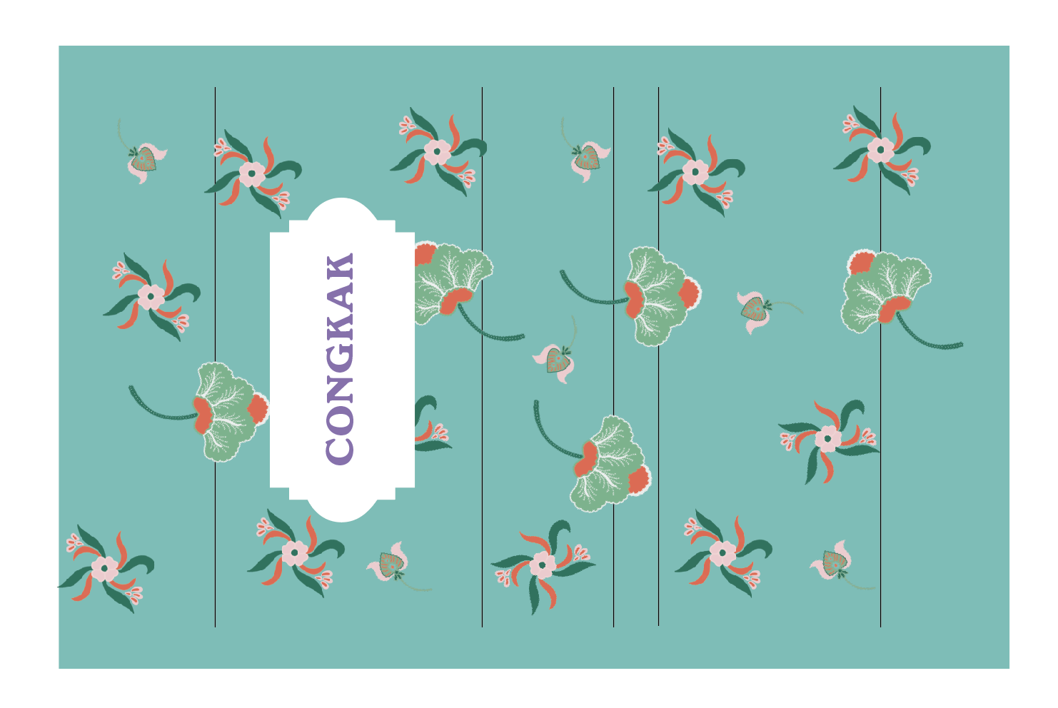
I manage to make another illustration for my packaging design. It's still the similar motifs from the previous drawings, but with different colors.
 |
| Fig 1.4 Flowers Illustrations |
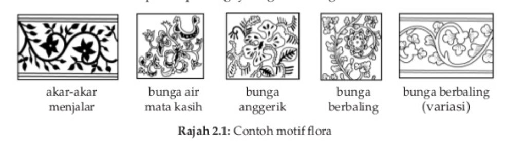
Malaysian batik motifs usually inspired by their nature habitat such as their flora. Most of Malaysians think that everything that attracts their eyes and have a philosophy at its own, could be a batik style/motif. Thus, I chose flowers motifs for my packaging design to represent the culture of Malaysia.
 |
| Fig 1.5 Example of Batik Motifs |
 |
| Fig 1.6 Bunga Anggerik |
 |
| Fig 1.7 Bunga Berbaling (Variasi) |
 |
| Fig 1.8 Akar-akar Menjalar |
Due to time constrain and it was Raya Break and I needed to go back to my hometown, I had to do my assignment there. I did 2 prototype for the box, but unfortunately I forgot to take a picture of the process. However, the size of the box was too big from the previous attempts, thus for the last one, I decided to make it smaller, and a bit tight to make the presentation look better as well.
Meanwhile, I started to make the sleeve design for the packaging also the instruction card.
 |
| Fig 1.9 Sleeve Design |
 |
| 1.10 Sleeve Design |
I thought the background was too light if I choose a light color, thus I try to use a dark background to make the illustration pop up.
 |
| Fig 1.11 Final Sleeve Design |
 |
| Fig 1.12 Instruction Card Design |
SUBMISSION
 |
| Fig 2.1 Top View |
 |
| Fig 2.2 Sleeve Opened |
 |
| Fig 2.3 Side View |
 |
| Fig 2.4 Bottom View |
 |
| Fig 2.5 Instruction Card |
 |
| Fig 2.6 Final Packaging |
 |
| Fig 2.7 Sleeve Opened |
 |
| Fig 2.8 Packaging GIF |
FEEDBACK
20/05/19 (Week 8)
Specific feedback: [online] It's quite contrast with the design element. I suggest you include some motif or traditional patterns into the design but make it contemporary.
10/06/19 (Week 11)
Specific feedback: The design is nice, it was hard to open the sleeve, you may want to make the sleeve slightly bigger.
17/06/19 (Week 12)
Specific feedback: Maybe add more of the flower to the sleeve because it's too plain on some part. Try to add ribbon and change the background color if you have time.
REFLECTION
Experience
I need to admit that packaging design is not my cup of tea. It was frustrating for me to think about all the measurement and because I was away from school and they don't have any laser cut service near my hometown, I had to cut my cardboard myself, also the sleeve and card. I failed a couple times, but I tried again. It was not my best work, but I tried to complete the project on time. I don't like to submit my project late, so I rushed myself for this one. Moreover, I felt like I wasn't using my time properly, thus I was so panic for this project, I was rushing and didn't put enough attention to some part of the task. Moreover, It was challenging to come up with an innovative packaging, because It was already hard for me to create a simple one, so I was afraid to try something new, and ended up choosing the possible type of packaging. After all, my chosen toy, which was congkak was quite big and hard to be packaged. Usually, they sell it without a packaging. Hence, I had to make the packaging easy to use as well, and also protective.
Observation
Through this project, I observed that usually traditional toys are not sold with a packaging. So, it was a clever idea to make a packaging for a traditional toy. Moreover, the design must not be traditional and outdated, we can make it more modern, trendy, but still include the culture aspect into it. I also observe that the shape of the packaging must be reasonable and easy to use not only innovative.
Findings
I found this project quite interesting, tiring, but I liked designing the packaging. I have learned that I needed to be more responsible for my action, wether in real life experience or my design. My design must reflect the actual purpose of the product, it should communicate well through the packaging. It was not easy to attract people with our own taste of design but we can always do some research, never give up to ask for opinion from lecturer or friends, and try to be professional when designing. Although it was not my best outcome, I hope that on the final project, I could explore more on packaging and learn to communicate through my design better.


Comments
Post a Comment