PUBLISHING II - PROJECT 1

31/08/18 - 28/08/18 (Week 1- Week 5)
Ashila Putri Sandi
Publishing 2: Mass Communication
Project 1: Content Generating
LECTURE
Lecture 1&2:
History of Prints
2nd -8th Century AD
- The emperor of China commands, in AD 175 the 6 main classics of Confucianism carved in stone
- Confucian scholars eager to own these important texts simply lay sheets of paper on the engraved slabs and rub all over it with charcoal or graphite taking away a text in white letters on a black ground
Korea and Japan: AD 750-768
- The invention of printing is a striking achievement of Buddhists in East Asia.
- Korea takes the lead, the world's earliest known printed document is a sutra printed on a paper (Korea AD 750)
- Followed in Japan by a bold experiment in mass circulation
The First Printed Book
- The first printed book is Chinese from the end of the T'ang Dynasty
- Discovered in a cave at Dunhuang in 1899 (scroll, 16 feet long and a foot high)
- The name of the book is Diamond Sutra
- Printing from wood blocks - only can be used once
- The carving of so many characters in reverse on wood blocks is an enormous investment of labor, but the task is unavoidable until the introduction of movable type.
Movable type (11th Century)
- A necessary step before printing can become an effective medium for disseminating information
- The concept is experimented with in China as early as the 11th century
Type foundry in Korea c 1380
- Established a foundry to cast movable type in bronze
- Problem: an unwieldy number of characters
Saints and playing Cards: AD c 1400
- The invention in the east, the technique of printing from wood blocks is introduced in Europe
- Playing cards are another early part of the western trade
- Gutenberg's great achievement in the story of printing has several components: his development of the printing press and capable of applying a rapid but steady downward pressure.
Gutenberg & Western Printing: AD 1439-1457
- The name of Gutenberg first appears, in connection with printing, in a law case in Strasbourg 1439
- He's being sued by two of his business partners
Formats
The book is a medium to document and transmit ideas, knowledge, records, history, and so on. Designing a book requires us to have a comprehensive understanding of typography, a good sense of space, and eye for details, and a good understanding of publishing software. There are content, targeted audience, size, binding, material and many other aspects that could be considered influenced and determine the format of a book.
"Innovation almost always shadows technology"
What does this mean? It means that there always a potential to use the new innovation, new technology makes people curious and want to find ways to innovate upon new things. For example, nowadays we live in digital technology where pretty much everything can be done on a desktop while ages ago people needed a typesetter. However, the development process of technology was expensive, drown out, and complex. Thus, it is important for us to make our own mark in every work field or creative class so people would know our work innovation whether it's good or not. Try to make something new and fresh, well it is quite hard because we still need a foundation and inspiration to actually create something, especially as a designer.
There are a lot of different formats used across time in different civilizations.
Iran-Iraq - Mesopotamia
- Pictographic writing on clay tablets
- The progression from simple and complex
- Used a stick to draw or write
India - Pakistan - Afghanistan Indus Valley River Civilizations
- Used soft clay tablet
- Cuneiform (earliest system of writing)
Palm Leaves Manuscript (Common Era)
- Located in Egypt, the oldest civilizations
- The scribes were the only people in ancient Egypt that could read and write Hieroglyphics
- Paper -> Papyrus-> thick paper from the pith of the papyrus plant
China - Han China
- Chinese characters in the early period are written in vertical columns, so a thin strip of bamboo is ideal for a single column.
- They used scroll format for their binding.
- The first printed book (Diamond Sutra 868 CE) was discovered in a cave at Dunhuang 1899
Turkey & The West
- Parchment was first invented in Turkey, 197-159 BC which later spread to Europe
- Made from animal hide
- Around 50 AD, Europeans started making parchment book
Lecture 3: Typo Redux
Typography is the art of arranging and composing text, it is also a medium for expression and most importantly communication. It plays a central role in any design work.
Characters in Typeface
Typography is the art of arranging and composing text, it is also a medium for expression and most importantly communication. It plays a central role in any design work.
Characters in Typeface
- Small Caps
- Numerals
- Fractions
- Ligatures
- Punctuations
- Mathematical signs
- Symbols
- Non-aligning figures
 |
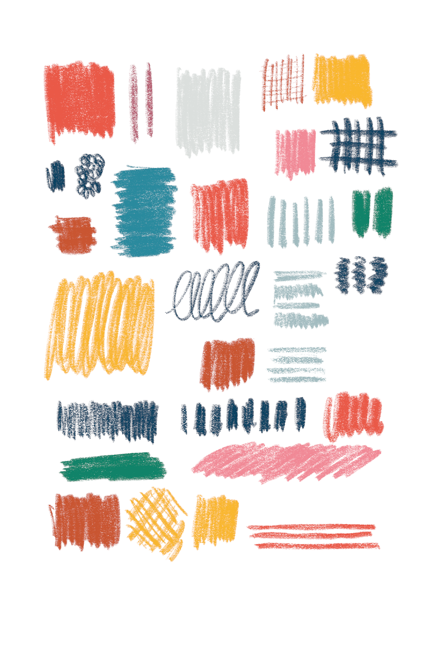
| Fig 1.1 Characters in a Typeface source: Behance.net |
 |
| Fig 1.2 Weight in Typeface |
Legibility
Open and well proportioned
The first step in making type legible is to choose text typefaces that are open and well proportioned for example classical serif typefaces such as Garamond, Bodoni, Bembo, Minion Pro, Baskerville, and so on. For the sans serif there are Gill Sans, Helvetica, Franklin Gothic, Myriad Pro, and more.
Special Styles
With a computer, we are able to do many things when we are typesetting (formatting text). With this came abuse, as many people weren't aware of the typographic conventions, violated them at expense of the reader. The following are some of the considerations to take on board when formatting text for legibility:
Underline: The underline should be lowered so that they do not touch the characters as this impedes readability. There are two types of underlines, one that effects entire sentences, and one that affects only the words.
Small Caps & All Caps: Small Capitals are good for subheads or for the first line of a paragraph. Text set in All Caps should be used in short headlines or subheads. All caps should never be used for long sentences and for emphasis.
Special-Purpose Style: Many formatting style exist within the software for making footnotes, references, etc. These tend to be embedded or nested within the tools sections and a lay user may not be aware of its functions.
Text Scaling: Some program allows the user to create a pseudo-condense or pseudo-extended font by horizontally or vertically squeezing or distorted a font. This distorts the original design of the font.
Outline & Shadow: Another style that tends to be abused a lot is the outline or shadow styles. This happens when deluded individuals through a flick of a mouse, and the aid of a software, think they can do magical things. It takes many years of practice and many more years of experience before one can format text beautifully and effectively. Please avoid outline and shadow as far as possible.
Type size, Line Length & Line Spacing
Text that flows naturally when read, is achieved when a harmonious relationship exists between type size, line length, and spaces between lines of type (line spacing or leading)
Even well-designed typefaces suffer from legibility impairment when just one of these aspects is out of balance.
A column of a type usually is about 50 characters across, and no more than 65 characters. The type that is too small will “cram” too many letters per line and make the copy hard to read. Remember, a type that is hard to read may not be read at all.
Font size determines line length, which in turn determines line spacing. The following below showcases the appropriate line length for the font size. The number of characters per line is at 50. This as you now know is the suggested number of characters a column of text should have.
Leading, or line spacing, refers to the amount of space between lines of type. As with type size, there are no set rules for how much line spacing to use; however, there are some major factors to consider:
•The font used—some fonts require more line spacing than others to keep their ascenders and descenders from touching.
•The line length—longer lines require more leading for easier reading.
•The type size—the larger the type size, the more line spacing is required. This rule mostly refers to body copy; headlines, which are normally set larger, may actually be set with tighter line spacing.
Many times, simply typing in the text and formatting the font, size, and line spacing is enough. However, depending on the program used, extra attention is needed. Larger type sizes need adjustments to the space between characters, and paragraphs need to be adjusted to eliminate “widows” and “orphans.”
Kerning: Inter-character spacing, known as kerning, creates a more pleasing look to the text. Most word processors do not allow kerning adjustments and most page-layout programs apply kerning automatically; however, certain letter combinations may require manual adjustments.
Tracking: The adjustment of word spacing is called Tracking. It is similar to kerning but refers to the adjustment of a selection of characters, words, and spaces. Its main purpose is to make type fit a required space without altering the type size or line spacing.
Word spacing, factors that determine correct word spacing includes typeface which is chosen, the size and weight of the type.
Alignment
Text can be aligned in 5 different ways:
Flush left, Ragged right:
Flush right, ragged left
Centered
Justified (left, centre & right)
Flush left, ragged right produces the very even letter and word spacing, and because lines of type terminate at different points, the reader is able to easily locate each new line. This is perhaps the most legible means of aligning text.
Flush right, ragged left alignments worked against the reader by making it difficult to find each new line. This method is suitable for small amounts of text but is not recommended for large amounts.
Centered alignments give the text a very formal appearance and are fine when used minimally. But setting large amounts of text in this way should be avoided.
Justified text can be very readable if the designer ensures spacing between words are consistent, and that awkward gaps “rivers” do not interrupt the flow of the text.
Paragraph Spacing
Paragraph Spacing is an automatic space between each paragraph that is applied when starting a new paragraph; once set, it can apply space either above the paragraph or below it. Paragraph spacing is a more elegant way to space out paragraphs than simply double spacing returns.
The most common indent is the small indent at the beginning of each paragraph, but indents have many more uses, including adding an element of design to the page.
First-line paragraph indents only should be used if there is no paragraph space because the indents and the paragraph space exist to inform the reader when a paragraph stops and a new one begins. Using both the indent and paragraph space is overkill.
The standard amount of indent is equal to the type size. For example, if the type size is 12 points, the indent should be 12 points. (Most programs allow the user to enter sizes in points if typed as “p12” or “12 pt”.) The amount of the first-line indent can be extended for design purposes.
Special Formatting
Hyphens are usually used only to divide words or numbers, but they also are used to break words from one line to the next. Headlines and subheads should never be hyphenated at a line ending.
Dashes come in two varieties: the en-dash and the em-dash. En-dashes are slightly longer than hyphens (usually, the width of the letter “N”), and are used to separate ranges of items, such as dates, quantities, and time. As a rule, if you can substitute the word “to” or “through”
En-dashes are slightly longer than hyphens (usually, the width of the letter “N”), and are used to separate ranges of items, such as dates, quantities, and time. As a rule, if you can substitute the word “to” or “through” in place of the dash, then the dash is used correctly.
The em-dash is used in place of a comma to set off a section of the sentence that requires special emphasis. However, it does have other uses, such as preceding the attribution of a quote. Typically, em-dashes are the width of the letter “M”.
Drop caps are used to start off new chapters and special sections of a report. You can create the cap, then alter the font, the style, and the color of the character through the use of a Character style. Many programs have settings to automatically create the drop caps; if the program does not have automatic settings, drop caps should be avoided.
INSTRUCTION
SUBMISSIONS
3000 Words Text Formatting
RESEARCH
References
References
 |
| Fig 2.1 Visual References and Color Scheme |
 |
| Fig 2.2 Visual Reference |
 |
| Fig 2.3 Visual Reference |
 |
| Fig 2.4 Visual Reference |
PROGRESSION
At first, I only make 6 illustrations and showed my progress to Mr. Vinod. He said that I was good to go and proceed to the next illustration. However, I needed to explore my illustration and make it related to the content.
Before I saved it to png, I compiled all of my illustrations to see if they compliment each other.
 |
| Fig 3.1 Assets 1 |
 |
| Fig 3.2 Assets 2 |
 |
| Fig 3.3 Assets 3 |
 |
| Fig 3.5 Compilation |
SUBMISSIONS
Thumbnails
 |
| Fig 4.1 Assets 1 |
 |
| Fig 4.2 Assets 2 |
 |
| Fig 4.3 Assets 3 |
 |
| Fig 4.4 Assets 4 |
 |
| Fig 4.5 Assets 5 |
 |
| Fig 4.6 Assets 6 |
 |
| Fig 4.7 Assets 7 |
 |
| Fig 4.8 Assets 8 |
 |
| Fig 4.9 Assets 9 |
 |
| Fig 4.10 Assets 10 |
 |
| Fig 4.11 Assets 11 |
 |
| Fig 4.12 Assets 12 |
 |
| Fig 4.13 Assets 13 |
 |
| Fig 4.14 Assets 14 |
 |
| Fig 4.15 Assets 15 |
 |
| Fig 4.16 Assets 16 |
 |
| Fig 4.17 Assets 17 |
 |
| Fig 4.18 Assets 18 |
 |
| Fig 4.19 Assets 19 |
 |
| Fig 4.20 Assets 20 |
 |
| Fig 4.21 Assets 21 |
Thumbnails
 |
| Fig 4.1 Visuals Compilation |
FEEDBACK
Week 3
Specific Feedback: I sent Mr. Vinod my references and told Mr. Vinod that I chose to go with Illustration than photography. However, Mr. Vinod told me that most of the classmates would use illustration for their work. Thus, while illustrating I would try to look through my archives and take some new photos. Moreover, Mr. Vinod said that my references seemed interesting and he reminded me that the images only need to be a symbolic representation. So this allows me to explore all kinds of visual objects.
Week 4
Specific Feedback: The illustrations were good. Continue to finish all the 16 visuals.
Week 5
Specific Feedback: Try to expand more of human being illustration for the visuals. Continue exploring for the visuals. So far, Mr. Vinod said they looked nice. Start working on the typesetting for the book using the grid has have been done for the exercise.
General Feedback: Make sure to update the e-portfolio blog weekly. Search for layout references, type specimen sheet, grid (3 options). Apply them to the first page - first chapter.
REFLECTION
Print & Finish by Gavin Ambrose and Paul Harris


Experience
I enjoyed this project so much because I could explore my own digital drawings. Although I like photography, in this task I challenge my self to do an illustration instead. However, it was hard for me to come up with 3000 words and make a story about myself so instead, I made a story about my journey and focusing on self-discovery. After doing half of the 3000 words, I realized that it wasn't that long for 3000 words. I was going to do more than 3000 words, but then I chose to stick with 3000 words and hope it would be enough for my book content.
Observation
I observed that the visuals that we made for our books were all different from one another. Different people have a different style to express themselves and it's important to maintain the consistency of our content (visuals).
Findings
I found out that doing publishing is not that simple yet it is very exciting to come up with a different layout, concept, ideas, and visuals each chapter. We need to maintain our signature of drawing and make a color scheme before doing the illustration to make our visuals connected one and another.
FURTHER READINGS

Graphic designers have an array of print processes and finishing techniques at their disposal with which to produce eye-catching and effective publications. Printing is the process of putting ink on to a substrate, but the method a designer chooses to use to do this will depend on practical factors such as cost, volume, and time, in addition to more aesthetic factors such as the quality of the visual result required. It says that different print processes such as letterpress, offset lithography and screen printing allow a designer to mix these variables to obtain different results, but that does not have to be the end of the printing process. Most printed products can be enhanced by some kind of finishing technique once the ink is on the paper, such as folding, die cutting, foil blocking or tipping-in colored plates.


Exploring Publication Design

Poppy Evans (2006) explores the world of print media in her book ‘Exploring Publication Design’. She identifies and elaborates the challenges that are faced when creating and publishing print media such as; magazines, newspaper, promotional literature, and other tangible print publications. She starts with the historical context of print publication in order to create a basic understanding and foundation for its readers. Further, into the book, print media elements are dissected into several parts. These sections include the fundamentals of publication design, color psychology, the importance of typefaces, how to structure an effective layout for different text types, the role of imagery, formatting a design, real-life case studies, and lastly, opportunities in the industry itself. Through the 9 sections that are clearly divided, ‘Exploring Publication Design’, hopes to explain how the rudimentary elements of print media work in cohesion with real-life examples that are credible.

Comments
Post a Comment