Web Design & New Media - FINAL PROJECT: LIFESTYLE WEBSITE
Web Design & New Media
Lifestyle Website
INSTRUCTION
LIFESTYLE WEBSITE (40%) EXPIRY DATE, WEEK 8
Lifestyle is a huge theme to discover. You might want to narrow down to a general topic for example entertainment or sports and specifically choose a specific title that you have more interest to. Please be careful when choosing the topic, as you will need to do intense research and prepare for the content. You are required to create a 5 pages of website. You need to propose the idea of the website, why do you choose the specific title, purpose, goal of the website and its target audience (please be specific).
PROGRESSION FLOW:
• Flowchart/ information structure – Week 3
• Mood board/Concept board –Week 3
• Wireframe – Week 4
• Prototype – Week 5
• Final project submission – Week 8
REQUIREMENT:
Students must follow the progression flow as given in completing the task. Marks will be given based on the progression flow stated above. The total file size of the website should not exceed 20mb.
OBJECTIVE:
The purpose of the assignment is to discover the ability of skill that you have required from the lesson throughout the semester. Students should be able to create a website using HTML and CSS and create a usable interface with specific typography for web.
PROCESSES
The first step I did was picked a topic. The general topic that was given is lifestyle, thus I thought about making a website that related to my daily basis which is healthy lifestyle. Then, I looked up to the internet and look for some inspiration and references. Furthermore, I made a simple mind map to break down my ideas.
After making a mind-map I began to make a mood board and look through the internet to find references that would suit my website. I chose a simple, aesthetic, and clean design with a smooth touch of pastel colour scheme. I also wanted my website to have a good images, and also editorial.
After giving my ideas and plans to Mr Shamsul, he approved my topic and told he to start gather the information. Mr Shamsul also said that I needed to make my own logo for the website to make it better and have a nice impression.
LIFESTYLE WEBSITE (40%) EXPIRY DATE, WEEK 8
Lifestyle is a huge theme to discover. You might want to narrow down to a general topic for example entertainment or sports and specifically choose a specific title that you have more interest to. Please be careful when choosing the topic, as you will need to do intense research and prepare for the content. You are required to create a 5 pages of website. You need to propose the idea of the website, why do you choose the specific title, purpose, goal of the website and its target audience (please be specific).
PROGRESSION FLOW:
• Flowchart/ information structure – Week 3
• Mood board/Concept board –Week 3
• Wireframe – Week 4
• Prototype – Week 5
• Final project submission – Week 8
REQUIREMENT:
Students must follow the progression flow as given in completing the task. Marks will be given based on the progression flow stated above. The total file size of the website should not exceed 20mb.
OBJECTIVE:
The purpose of the assignment is to discover the ability of skill that you have required from the lesson throughout the semester. Students should be able to create a website using HTML and CSS and create a usable interface with specific typography for web.
PROCESSES
The first step I did was picked a topic. The general topic that was given is lifestyle, thus I thought about making a website that related to my daily basis which is healthy lifestyle. Then, I looked up to the internet and look for some inspiration and references. Furthermore, I made a simple mind map to break down my ideas.
 |
| Fig 1. The Content Mind-map |
After making a mind-map I began to make a mood board and look through the internet to find references that would suit my website. I chose a simple, aesthetic, and clean design with a smooth touch of pastel colour scheme. I also wanted my website to have a good images, and also editorial.
 |
| Fig 2. The References from Pinterest |
 |
| Fig 3. References/ mood board from pinterest |
 |
| Fig 4. Mood Board that I made on my sketch book |
 |
| Fig 5. Some of references that I took from Pinterest |
 |
| Fig 6. Logo (sketch) |
 |
| Fig 7. Digitalised the logo on Illustrator |
 |
| Fig 8. Final Logo Loook (Change the font) |
After I made the logo, I began to start my webpage. The project was required 5 pages, one homepage and 4 different content. Although I already did some research, I still wanted to add more information. However, It was difficult for me to choose which part should I go because there were a lot of information that I could put on the page.
Fig 9. The first breakdown ideas
The pictures above are my first ideas of my content. Nonetheless, I changed it a couple of times because I was searching for the right/match content. After making the idea list, I started to take some pictures by my own then put it on my page.
Fig 10. The first try for the webpage(s)
I did four pages and I was almost done. However, I thought it was too messy, simple, but boring. So, what I did was redo all my work, I change the content a bit, but used the same colour scheme. Then, I tried to sketch my layout first this time.
 |
| Fig 11. Home page and 1st page layout |
 |
| Fig 12. Second and Third page layout |
 |
| Fig 13 The last page layout |
 |
 |
 |
| Fig 14. References from behance |
I managed to redo my website and used these references above for inspiration.
 | ||
|
FINAL OUTCOME
Home Page
Health & Nutrition
Fitness
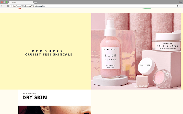
Beauty


Comments
Post a Comment