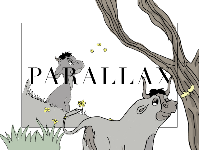
Illustration & Visual Narrative Final Project; Parallax

Week 11 - Week 14
GCD60204, Hafiz Zamri
Illustration and Visual Narrative
Final Project: Parallax
Instruction
Project 3: Parallax
Description
An undertaking of a series of Illustrations to illuminate narrative spaces and transitions that allow to demonstrate technical and conceptual abilities.
Narratives can be conveyed in many ways. Some narratives follow a traditional linear arc. Other narratives loop in time, flash forward and back, restructure sequence or employ aspect-to-aspect transitions. Some view the same incident from different perspectives. Multiple narratives can be spliced together. Events can be placed in random order. Panels can be subverted. And several narrative threads can be simultaneously told. Narratives can be poetic. They can explore internal emotions instead of external action. They can investigate a central theme. Narratives can be shaped around predetermined rules. They can be reversed, labyrinthine in nature, and involve multiple readings with ambiguous beginnings and endings.
Outcome
Based on the given narrative you are to create a series of illustration to demonstrate the passage of time that leads to the one piece or concludes it.
All outcomes must utilize at least 3 layers and identify 3 transitional types (Scott McCloud). The outcome may include more than one perspective point, meaning it can be viewed from back to front, right to left vice versa.
Weightage
The portfolio totals 40% of the final grades. There will be checkpoints and marks shall be awarded at the checkpoint. The total weight of this assignment is 40% of the final marks.
10 Marks for a show of progress on week 10 - 11 Storytelling and storyboarding. Composition and Layers
LO1 Identify and undertake research into specific design problems or issues, and demonstrate an awareness of historical, cultural and contemporary issues.
10 Marks for show of progress on week 11 - 12 Transitions
LO5 Display evidence of creative thinking through the exploration and communication of design concepts.
20 Marks for show of progress on week 12 - 14 Creative Direction and Technical Direction. Suitability of finishing
LO2 Illustrate proficiency in the appropriate use of drawing, or other visual communication techniques in physical and/or digital environments.
LO3 Effectively use tacit making skills and/or traditional media techniques in an appropriate manner.
Note:
Though assignments may differ in a category, ultimately marking criteria is based on the learning outcomes of the module. To cross-reference the relationship refer to the following:
Research and Development
LO1 Identify and undertake research into specific design problems or issues, and demonstrate an awareness of historical, cultural and contemporary issues.
Creative Direction
LO5 Display evidence of creative thinking through the exploration and communication of design concepts.
Technical Direction
LO2 Illustrate proficiency in the appropriate use of drawing, or other visual communication techniques in physical and/or digital environments.
LO3 Effectively use tacit making skills and/or traditional media techniques in an appropriate manner.
Work Processes
Choose a Story, Make a Mind-map and do Sketches
The first step of doing this project was choosing a story then I made a mind-map based on the story that I choose, also I did my sketches. First I chose to do the Three Little Pig fable story but Mr. Hafiz said that he didn't recommend me to do it. So, I chose another fable story which was Ferdinand The Bull/ The Story of Ferdinand. I chose fable story because I thought It would be interesting to illustrate an animal. After understanding the story I began to do my sketches. I didn't do my sketches well, but I already had my ideas on my mind. Thus, I chose to implement my ideas straight to the digital concept.
 |
| Fig 1.1 Mind-map |
 |
| Fig 1.2 Sketch 1st Panel |
 |
| Fig 1.3 Sketch: 2nd Panel |
 |
| Fig 1.4 Sketch: 3rd Panel |
 |
| Fig 1.5 Sketch: 4th Panel |
 |
| Fig 1.6 Sketch: 5th Panel |
 |
| Fig 1.7 Sketch: 6th Panel |
Mood boards
For the mood board, I was inspired by the hobolobo.net kind of style and by choosing only particular colour and not make it very detail on the colouring.
 |
| Fig 2.1 Mood Board |
For the visual drawing, I chose to use Adobe Photoshop because I felt comfortable using Adobe Photoshop for drawing with a Wacom tablet. I traced some of the drawings and also drew it by my imagination. After I drew all of the characters and the transitions, I saved each of the files to PNG file.
 |
| Fig 3.1 The Drawings that I made in Adobe Photoshop |
Then, after saving all the PNG files I began to compile all the drawings into my artboard in Adobe Illustrator. For the artboard size, I looked into Mr. Hafiz work on Google Drive and make it the same size as his work. In the Illustrator I had to make three kinds of different layer group which were foreground, midground, and background.
 |
Drawing Digitally in Photoshop, Compile All The Drawings on Illustrator
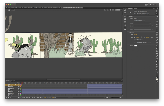
After making the artboard, and did the animation in Adobe Animate, I import all the files then arranged it one by one by making a keyframe then I add a classic tween to make a transition. At first, I thought I was doing good, but then I found out that my file size was wrong and I couldn't be able to make an actual HTML file and open it on the browser. My file got distorted and the button that I made was not working. I asked some of my seniors and asked for their help but they also didn't know what was the problem. At the end I had to redo my work and it still didn't work. So, Mr Hafiz told me to record the video instead, but the video also didn't work that well like what I did on the Adobe Animate panel.

I uploaded the video to youtube but turned out the animation that I made in the Adobe Animate looked a lot better than the exported video.
Reflection
From this module and especially this final project I've learned a lot. There are a lot of things that I should be aware of when making a document. I found that I sometimes don't really pay much attention to the image size or the artboard size while working on my project. Another thing is that I need to learn more about transition and composition. Also, I need to improve my skills in Adobe Illustrator and Photoshop because I'm not that expert and I easily forgot about what I've learned before. I probably had a lot of obstacles while going through my first year, especially on this module but I kept trying to do my best and hoping to do a lot better in the next semester.


Comments
Post a Comment